Documentary vs Editorial Rendering: Which One Sells?

Lukas Berezowiec · CEO of NoTriangle Studio
Updated · 8 minutes
Key takeaways
A documentary rendering shows a design clearly and fairly so it can be approved; an editorial rendering uses dramatic light and atmosphere to make a buyer feel the place.
- Documentary
- Fair, even light and full visibility, for the question: is this right.
- Editorial
- Dramatic light, atmosphere and a suggested lifestyle, built to make a buyer want the place.
- The trade-off
- A dramatic image almost always shows less of the design than a documentary one.
- The set
- A few images carry the emotion and the rest carry the information, decided at the moodboard.
A documentary rendering shows a design clearly and fairly, with even daylight and nothing hidden, so it can be checked and approved. An editorial rendering uses dramatic light and atmosphere to make a buyer feel the place, and shows less of the design to do it. Approval images should be documentary; most sales sets mix both.
There are two kinds of architectural rendering, and they do almost opposite jobs. One is built to show a design clearly and fairly, so that the people responsible for it can look at the image and agree that this is the building. The other is built to make a stranger want the place before they have set foot in it. They are not two levels of quality. They are two different intentions, and the most common mistake in a brief is asking for one when you needed the other. We call them documentary and editorial.
Getting the choice right, and knowing that a single project usually needs both across its milestones, is one of the quieter differences between imagery that does its job and imagery that looks impressive and sells nothing. Here is how the two actually behave in the real world.
The Two Modes, Defined
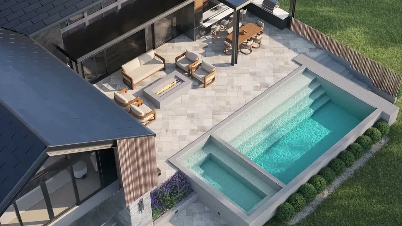
A documentary rendering is clean and accurate. It uses fair, even lighting, favors daylight, and gives you full visibility of the space. Nothing is hidden in shadow, nothing is exaggerated. Its job is to communicate the design honestly, so that an architect, a board, a marketing team, or a lender can look at it and understand exactly what is being built. It is the imagery you want when the question on the table is: is this right.
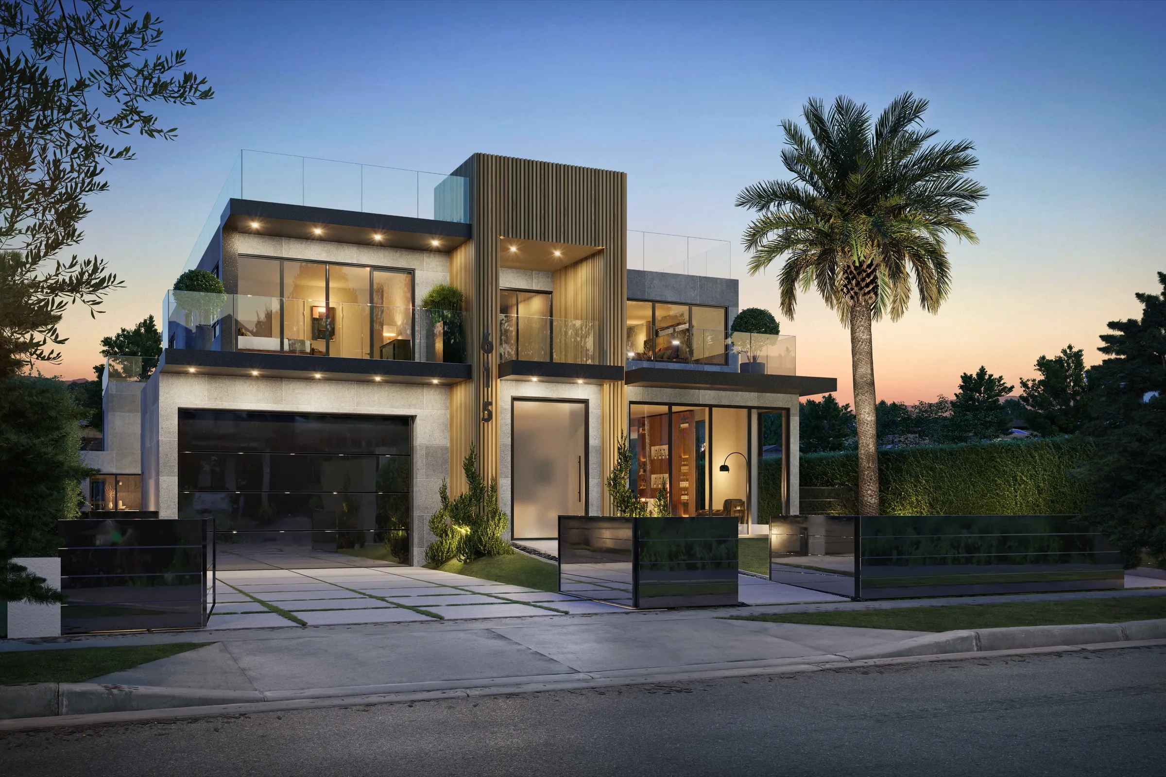
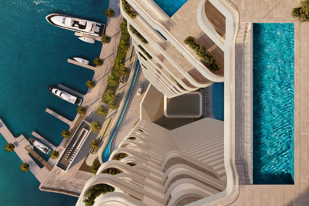
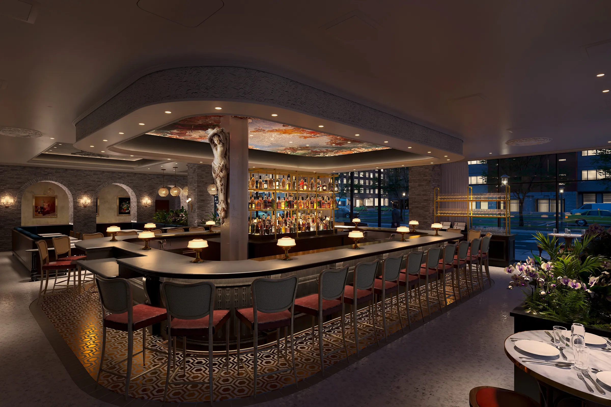
An editorial rendering is the kind of image you see in a design magazine or on a luxury developer’s Instagram. It uses dramatic light, atmosphere, and a suggested lifestyle to create emotional impact. It is not trying to catalog the design. It is trying to make you feel the place, at the golden hour, when the light is doing the most flattering thing it can. A developer marketing a branded luxury tower put the distinction to us better than we ever have: an interior designer’s own renders show the design intent, she said, and the space looks nice, but it does not give her the emotional hook she needs for marketing. She was not asking to change the design. She wanted the same space rendered so that when somebody looks at it, they feel the mood of it, not just see the room. Editorial here describes mood, not production quality. Both modes should be built to the same high standard; the separate question of listing-grade versus editorial-grade production is covered in editorial vs listing-grade renderings for luxury homes.
The Trade-Off Nobody Mentions
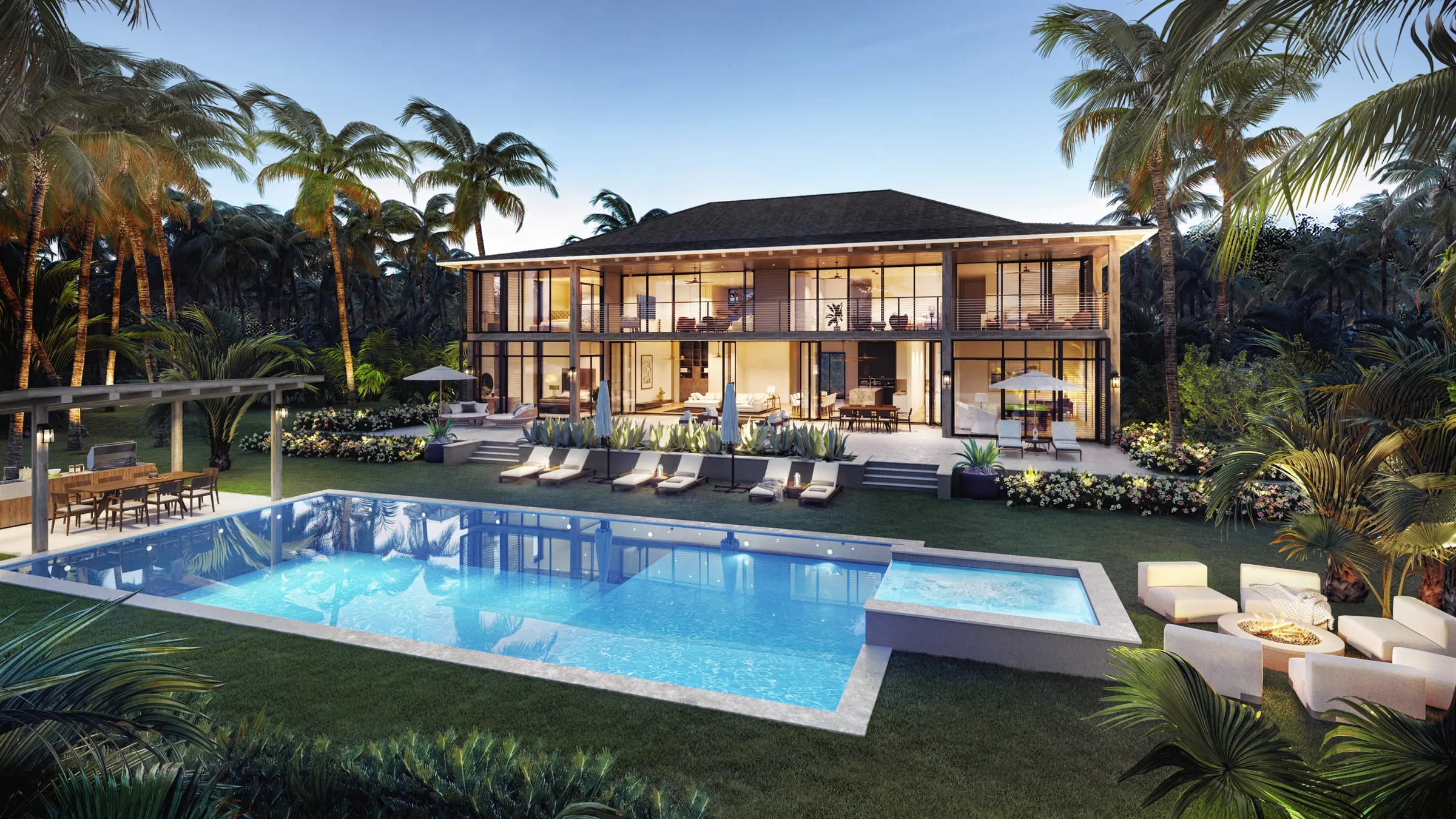
Here is the part that gets left out of most conversations about rendering style: a dramatic image almost always shows less of the design than a documentary one. That is not a flaw. It is the mechanism. Mood comes from selective light and deep shadow, and shadow is, by definition, the part of the image you cannot see into. The more atmospheric the frame, the more of the actual space it conceals.
That trade-off becomes a real decision on real projects. On a pool and amenity area for a New York new-development team, we flagged that a blue-hour treatment would look beautiful but would not let a buyer see much of the amenity itself, because a smaller space lit for drama reads as atmosphere rather than as a place you can use. The client, a sales professional, chose accuracy for that shot: as photorealistic and as accurate as possible, in their words, because the space had to be legible. You can watch a client make the same correction in real time. On a Caribbean resort, the marketing lead came back on a hero image to say the saturation of the sunset and the ocean was overpowering what you could see on the deck, and asked for a less dramatic sky and the shadows lightened. The drama was not ugly. It was eating the thing being sold. The same tension shows up inside a single luxury project. On a branded tower, the marketing lead loved the mood, but she pulled us back on a cigar-lounge render that had gone too far into darkness. It was not giving her the feeling of a luxury space anymore. It was just dark. Editorial has a limit, and the limit is the moment the buyer stops seeing the product.
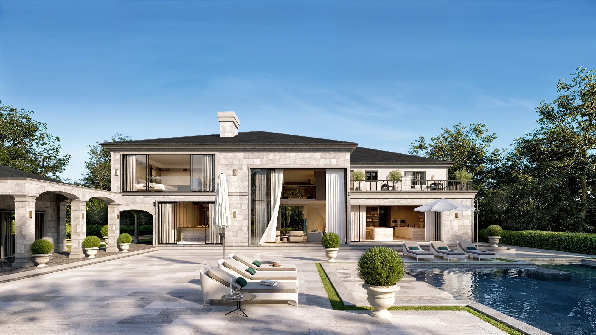
Approval Versus the Sell
The clearest way to choose is to ask what the image has to accomplish. If it has to be approved, it wants to be documentary. If it has to be desired, it wants to be editorial. The two goals pull in different directions, which is why the same building often needs to be rendered both ways at different points in its life.
The approval end is unglamorous and essential. An architect signing off on a facade, a board clearing a design, an operator confirming that their brand is being represented correctly: all of that needs fair, accurate, daylight imagery where nothing is disguised. You can watch a single client hold the two jobs apart cleanly. On one community, the team split the deliverables in a single email: the daytime aerial was for the planning board meeting, and a separate set of dusk views were, in their own words, for marketing and not for the board. Same project, two sets of images, opposite assignments. On another approval document, a developer was explicit that they could not use dramatic or off-trend renderings in that particular kind of document, because in an image built to be approved, drama is not an asset. It is a distraction from the facts the reviewer came to check. The selling end is the opposite. On an active-adult community, the marketing architect was refreshingly blunt about the job of her renders. They were, in her words, just trying to sell the building and lease it up, and to do that she wanted the twilight treatment on the hero view to showcase the skyline. Nobody was confused about which mode that shot was in. It was there to make people want to live there, and it was lit accordingly.
Why Most Sets Need Both
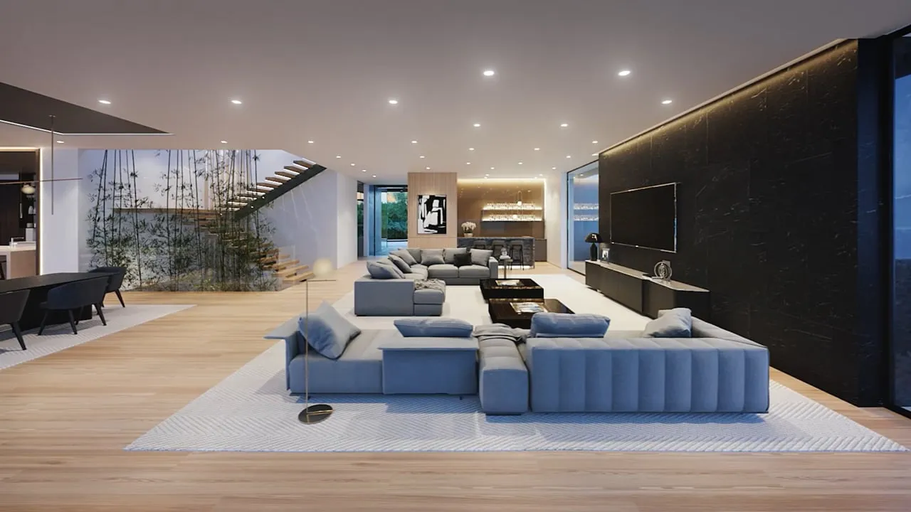
In practice, the answer is rarely to pick one mode for a whole project. It is to build a set where a few images carry the emotion and the rest carry the information. Agents talk about this instinctively. On a set of golf-community cottages, the developer’s team called the dusk shot the money picture, the one image lit for the evening when people would gather after a day outside. But they did not want the whole set that way. They ordered the money shot in twilight and the working views in daylight, where the job was to show the active amenities, the courts, the cars in the lot, the life of the place.
You can watch the same logic drive a launch calendar. At Austin Surf Club, once a unit type had sold, the team decided to spend their editorial budget where it would move product: extra golden-hour images of the specific duplex they most needed to sell, while keeping the core set consistent in daylight. On a lakefront condominium, the marketing team wanted a twilight view straight from their marketing meeting, but the same person immediately set the guardrail, that the units must not read dark inside and the rooms had to look their full size. That is the discipline of a good set. Editorial where it earns a feeling, documentary where a buyer needs to understand what they are getting, and a clear head about which shot is doing which job.
The Decision Belongs at the Moodboard, Not the End
The reason this matters early is that style is not something you paint on at the finish. It is decided at the moodboard, before any modeling begins, because the lighting approach, the time of day, and the atmosphere shape how the whole image is built. A studio that agrees the documentary-versus-editorial split with you up front, shot by shot, is protecting you from the worst outcome: a set that is uniformly dramatic and sells nothing, or uniformly flat and moves no one. The mode of each image is a strategy question, and it is worth answering deliberately rather than discovering after the renders are done that the money shot is a working shot and the working shots have no money in them.
The way we describe the job to every client holds both modes inside one standard. A rendering has to do three things at once: give a buyer the clarity to understand exactly what they are getting, make an emotional connection so that seeing it evokes a feeling, and leave them with certainty, no gap between the image and the finished building. Clarity and certainty are the documentary half of that. The emotional connection is the editorial half. A good set delivers all three across its images, rather than asking any single frame to carry what it cannot.
For where this decision sits in the wider process, read the architectural visualization process, stage by stage, and see how one angle is rendered at more than one time of day in day, dusk and night rendering versions, and why the composition gets locked first in why we white-model every angle before adding color. For the finished work, look at 1660 Casale Road and Sankari Place. If you have a set to plan, Book a call and we will work through which shots should be documentary and which editorial.
FAQs
What is a documentary rendering?+
A documentary rendering shows a design as it is: fair, even light, usually daylight, full visibility of the space, nothing exaggerated or hidden in shadow. It is the image you want when the question is whether the design is right, for an architect's sign-off, a review board, an operator's brand check, or a lender.
What is an editorial rendering?+
An editorial rendering uses dramatic light, atmosphere, and a suggested lifestyle to create an emotional response, the register of a design magazine or a luxury developer's Instagram. It deliberately shows less of the design, because mood comes from selective light and shadow. It is built to make a buyer want the place.
Which rendering style should I use for a planning or review board?+
Documentary. Boards come to check facts: massing, materials, site elements. Dramatic lighting reads as a distraction in that setting. Many projects split the deliverables, for example a daytime aerial for the planning board and a separate set of dusk views for marketing.
Should a marketing set be all editorial?+
Rarely. The strongest sets use a few editorial images for emotion, such as a twilight hero, and documentary-style daylight views where buyers need to understand what they are getting. Decide the mode of each shot at the moodboard stage, before modeling, rather than at the end.