How Renderings Give a New Development Its Identity Before Launch

Lukas Berezowiec · CEO of NoTriangle Studio
· 9 minutes
Key takeaways
A brand book is not an identity until it shows up in the images. These are the four things that carry it.
- Carrier 01
- One light and time of day, held across every image
- Carrier 02
- One palette, repeated and varied on purpose
- Carrier 03
- One camera language, from hero shot to detail
- Carrier 04
- One repeated human moment, never a stock-photo crowd
Most developers come to us with a brand book already finished: a name, a logo, a color palette, a tone of voice. What they don’t have yet is the thing a buyer actually sees first, the images. A brand book sitting in a folder does nothing for a buyer scrolling past an ad at ten at night. The renderings are the first contact the market has with the identity, and if they don’t carry it, the identity doesn’t exist yet.
This is the gap we see most often in pre-launch marketing. Page one of a search for “real estate development branding” is full of naming agencies, logo studios and microsite builders, and almost none of it explains how identity gets into the images, which is strange, because for an unbuilt building, the images are the only thing a buyer can judge.
A Name Is Not an Identity
A brand book tells you what a development is supposed to feel like. It rarely tells you what the renderings should actually do to make a stranger feel that way, and that gap is where a lot of launches lose their identity before they ever get it.
The gap shows up in a specific way. A developer hands a rendering studio a brief built from the brand deck, colors, fonts, a tagline. The studio produces technically clean images of the building. They are accurate. They are not an identity, and they could be swapped for a dozen other projects in the same market without anyone noticing.
An identity, in a render set, is not decoration added on top of accurate geometry. It is a set of consistent choices repeated across every image: the same light, the same palette, the same way the camera looks at a building, and the same kind of human moment every time a person appears. Those four choices are what a buyer actually absorbs, usually without being able to name any of them.
The Four Things That Carry Identity in a Render Set
We treat these as a checklist before a single camera is set, decided on purpose rather than drifting in from habit.
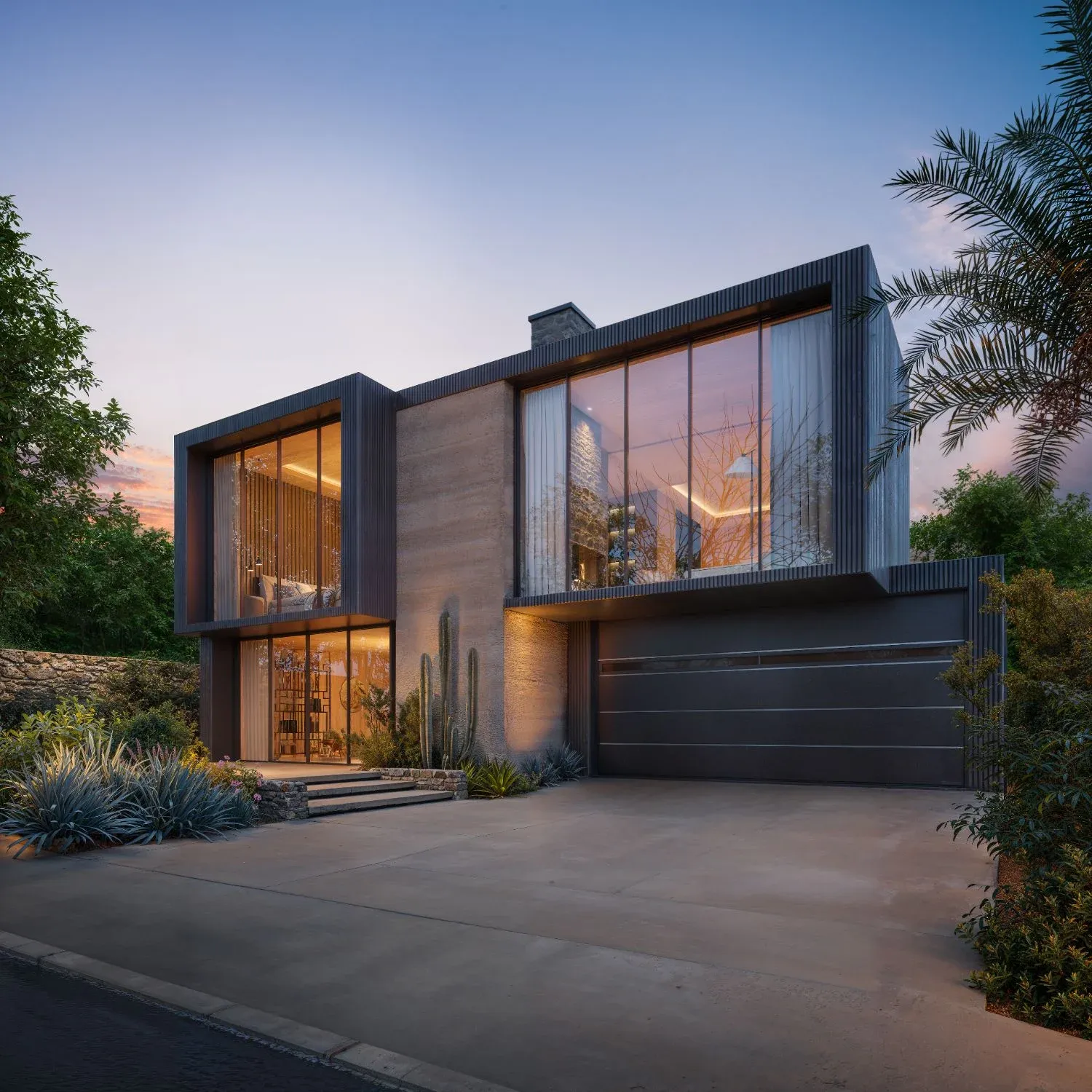
A light and time of day, held across the set. Flat midday light says nothing. A consistent choice, a low golden-hour sun, a blue-hour twilight with interior glow, a soft overcast for a wellness-led project, tells the buyer something specific about how the place is meant to feel, and it only works if it repeats. One twilight hero next to three flat daylight interiors reads as two different projects shot by two different teams.
A palette, repeated and varied on purpose. Not just wall colors, but the materials that recur in frame after frame: a stone, a timber tone, a metal finish, a planting palette. Repetition is what makes it a visual language instead of a series of unrelated pretty pictures, and controlled variation is what keeps individual homes or units from feeling identical.
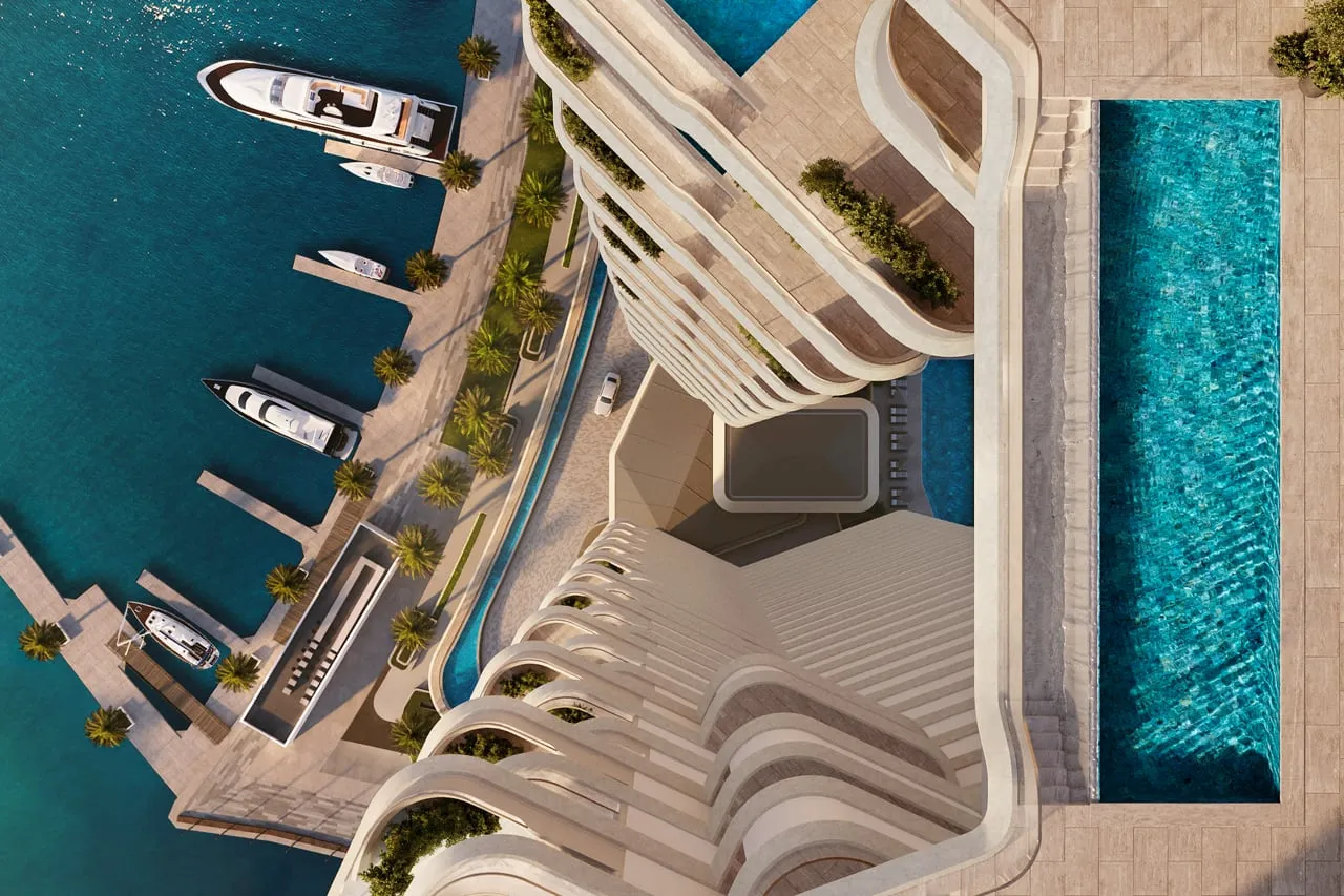
A camera language, from the hero shot down to the detail. Height, distance, and framing carry tone as much as light does. Low and close says intimate and residential. Pulled back and looking down says scale and ambition. Whichever a project picks, it has to hold across the hero image, the amenity shots, and the detail renders, or the set stops feeling like one place.
One repeated human moment, never a stock-photo crowd. The people in a render set, when there are any, should be doing roughly the same kind of thing across images: a couple at a kitchen island, two figures on a terrace at dusk, a resident walking a dog past the entrance. A different demographic and activity in every frame reads as stock photography, not a life this building is offering.
Start From the Buyer, Not the Building
The four carriers above only point in the right direction once you know who the images are for. A first-time buyer, a downsizer and an ultra-high-net-worth individual who travels for a living do not read the same light, palette or camera the same way, so the styling decision has to start with the audience, not the elevation.
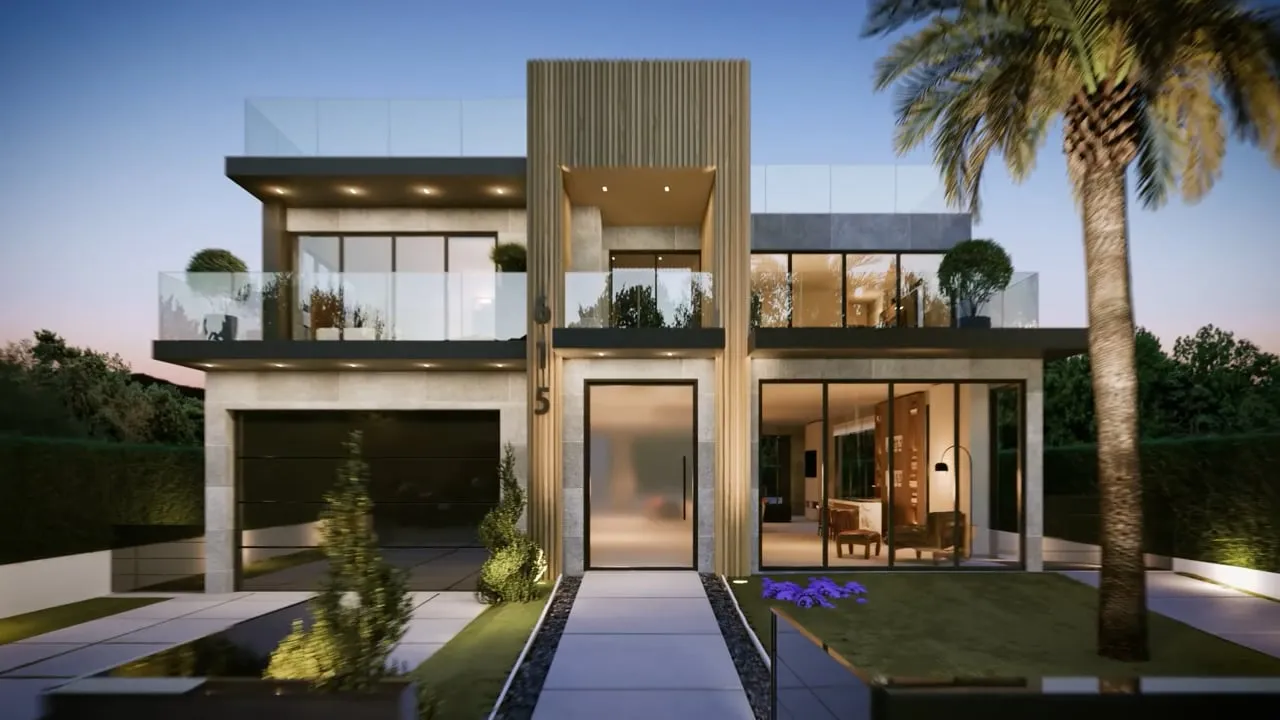
We saw this directly on Muse, a 108-home condominium in Guildford, Surrey, BC. The starting point there was not the model, it was the buyers: first-time buyers, young families, downsizers, and investors, each reading the same images for different reassurances. A competitive read of comparable Guildford developments followed, and only then did camera selection, lighting direction and material emphasis get decided. The building did not change between those two inputs and the final images. The identity did.
Tease First, Explain Later
On Sankari Place, the world’s first upper-luxury standalone Regent Residences in Business Bay, Dubai, the brief was to build anticipation rather than explain the building. The brand was already set, Foster + Partners towers, a Regent (IHG) operator, but the identity still had to arrive through the images, on a hard date.
We led with a teaser strategy: reveal less, create more desire. The cinematic film was built from close-up architectural moments, partial views, atmospheric light and material detail, suggestion rather than explanation, much like a film teaser released before principal photography. The imagery carried the Sankari and IHG launch announcement in September 2024, delivered as 15 priority renderings and a cinematic film first, with the fuller set of marketing renderings following for the sales phase once the teaser had done its job.
The sequencing is the identity decision (we cover phasing a branded launch in more depth elsewhere). A development that shows everything on day one has nothing left to reveal on day sixty. One that teases first keeps the market paying attention.
When Two Houses Look the Same
Identity is also what you reach for when a project needs to stand apart from something that looks almost exactly like it.
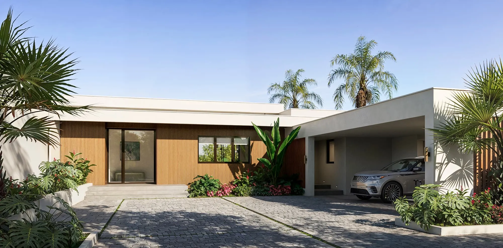
Villa Solene, a single-story spec villa at Apes Hill, Barbados, had a near twin on the lot next door: the same approved floor plan, built by the same developer. The home had also already been to market once, on an earlier set of renderings, before the listing was relaunched with a new offer, and the developer did not want the relaunch to look like the old listing reposted, or like the house next door either.
The floor plan, bedrooms, bathrooms, kitchen and living spaces stayed exactly as approved, and the garage and front door could not move, because the lot boundaries fixed them. What changed was the material identity: vertical timber-slat cladding against white render on the entrance elevation, carried through with a two-tone kitchen and a warm, neutral interior palette inside. The same approved floor plan came back to market as a house with its own face, clearly distinct from its twin next door.
The renderings were delivered in October 2025. By November the house was sold. In the developer’s own words, the first customer who came along saw the renderings and bought it. There was no finished home to walk through, so the images were the house the buyer committed to, and the identity built into them was what separated this listing from its twin.
A Community Needs One Visual Language
A single home has one identity to carry. A community has to carry one identity across dozens of homes without making them all look identical, the harder version of the same problem.
Austin Surf Club, a members-only surf community from Discovery Land Company and pro surfer Kelly Slater, is a craft example of how that gets solved: stone bases, timber siding and tongue-and-groove cladding, organized into three named palettes, Wave, Cliff and Sand. The combinations varied from house to house, cottages, duplexes, suites and more, so each home had its own character, while shared camera angles, lighting and landscaping kept the whole community reading as one coherent destination. The club’s team put the renderings straight into its marketing materials and sent them out to members. The community is still in development, construction paused in April 2026 with no restart date announced at the time of writing, so this is a craft example of the identity work rather than a sales outcome.
We see the same pattern wherever a single brand has to stretch across many homes. On Clear Creek, a mountain-modern estate at Lake Tahoe, the direction was one unified visual brand across every channel, timber and stone held constant from the film to the stills. On The Addie at Westlake, a 46-home gated enclave in Austin, Texas, the identity was built into a hero animation moving from aerial context to street level and through the gated entrance before a single home was shown, and the community sold out by spring 2021, completing in December 2022.
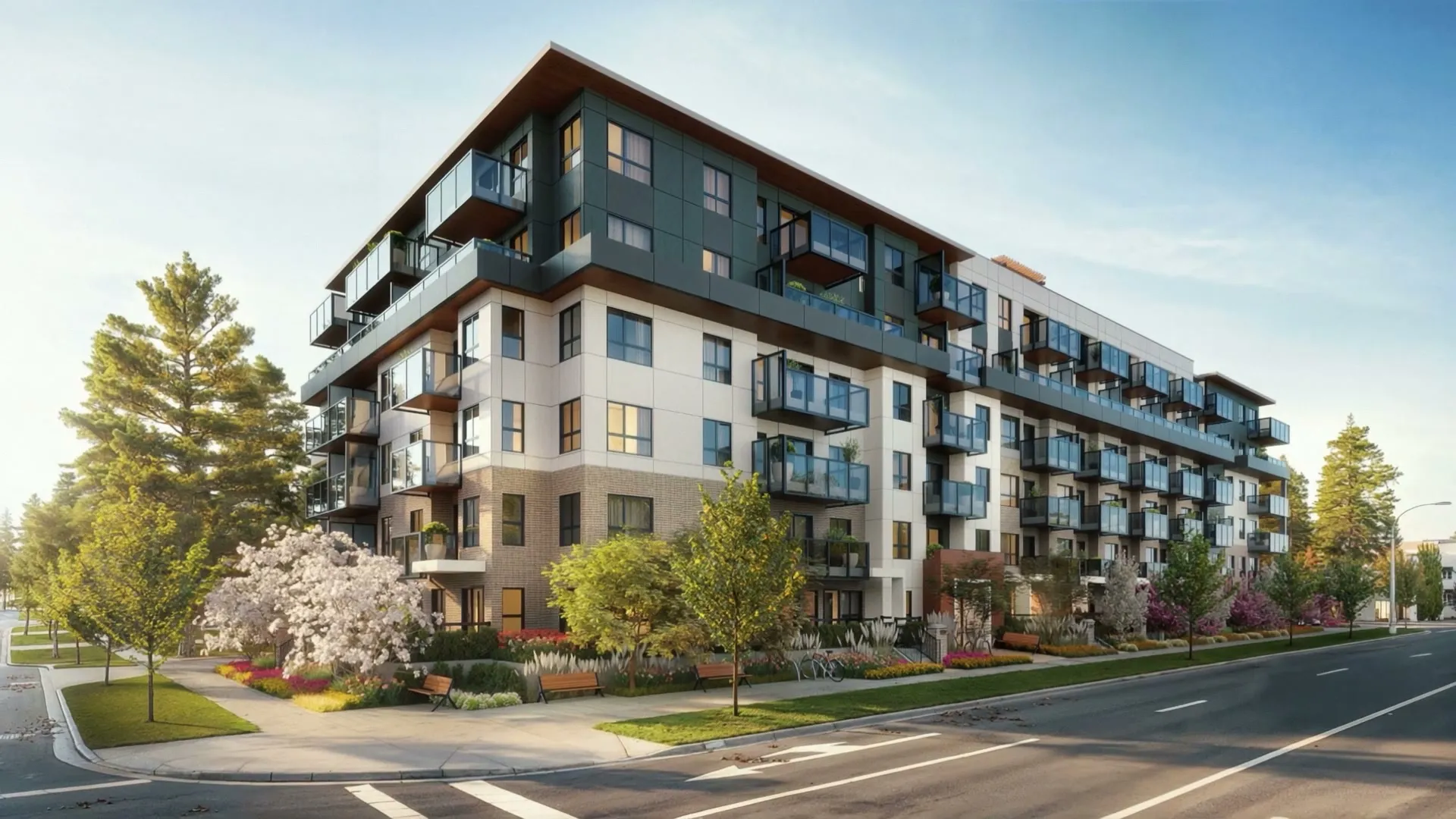
Muse carried an extra layer of identity pressure: it is the debut of its developer’s Portrait Collection, a residential brand that had never shown a building to the public before. The visual direction centered on aspirational warmth, clean, bright lighting with subtle warmth, held consistently across exteriors, interiors and amenity views so the set read as a single brand narrative rather than fourteen separate renderings. The building is under construction and the public sales launch has not been held yet, so this is a launch-campaign example rather than a sales outcome.
Working With Your Branding Agency
Not every developer builds the brand in house. Branding agencies regularly bring us in as their visualization partner, delivering the imagery that carries the brand work they lead, because strategy and naming are one discipline and photoreal rendering is another.
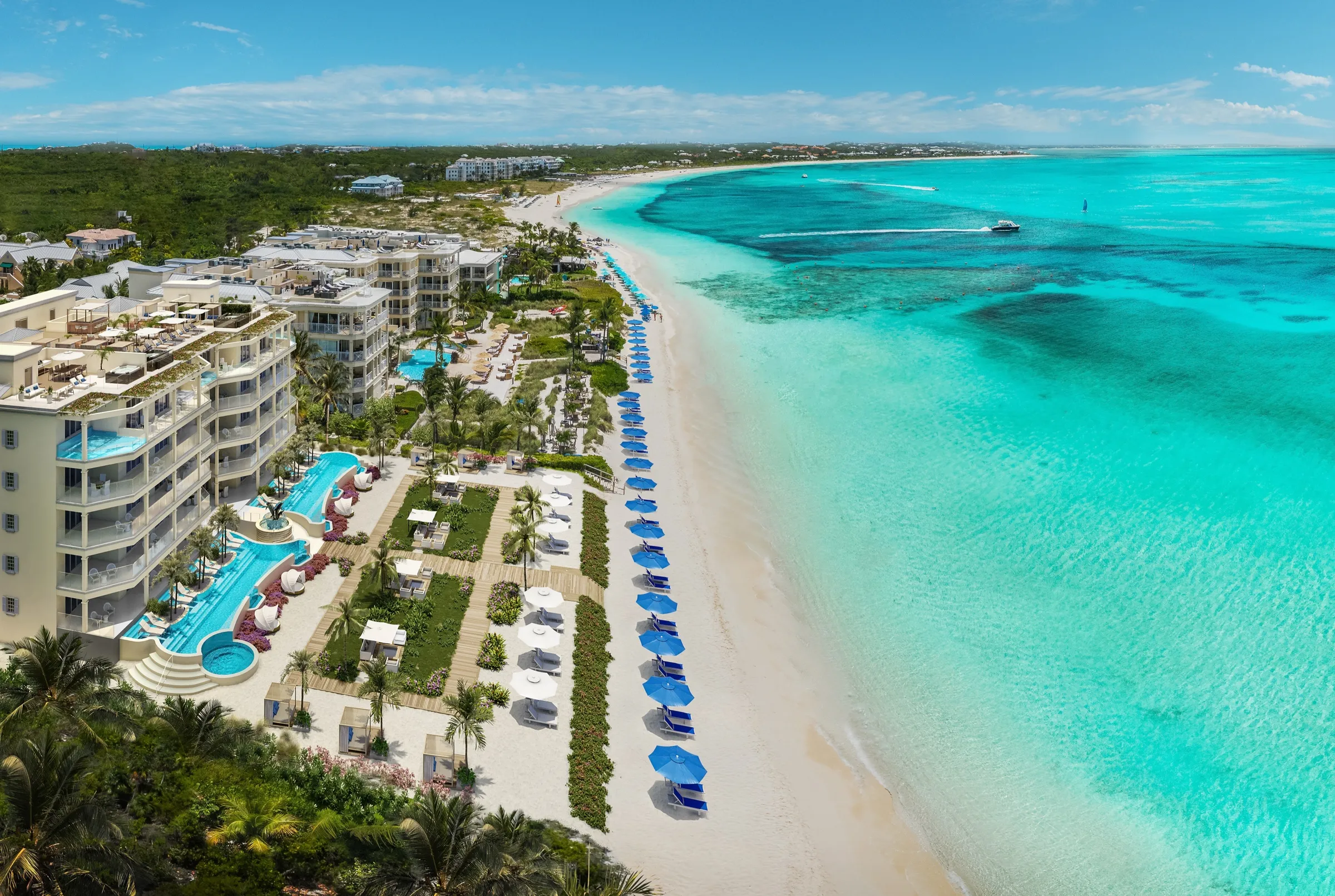
Esmé Beach Residences, a beachfront condominium on Dubai Islands, is an example of that arrangement: the branding agency on the project leads the brand work, and we deliver the visual inventory that puts it in front of buyers (we are not naming the agency here, by agreement). When an agency and a rendering studio are both touching the same images, feedback has to move through one funnel, not three. The brand holder sets the palette, tone and messaging; the studio sets light, camera and composition inside that direction; and the developer approves. That is where identity usually survives or quietly falls apart through weeks of revisions.
Key Takeaways
- A brand book is not an identity until it shows up consistently in the images a buyer actually sees.
- Four things carry it: one light and time of day, one palette, one camera language, and one repeated human moment.
- The styling decision starts with the buyer the images are for, not with the building.
- A teaser-first sequence, as on Sankari Place, builds anticipation instead of spending everything on day one.
- A community of many homes, as at Austin Surf Club, needs shared cues to read as one place while each home keeps its own character.
- When a branding agency leads the strategy, one comments funnel is what keeps the identity intact through revisions.
FAQ
How do I give my new development an identity before it is built? Decide, before any rendering is produced, on one light and time of day, one material palette, one camera language and, if people appear, one repeated human moment. Hold all four consistently across every image. The identity comes from the repetition, not from any single hero shot.
What makes renderings feel like a real place and not just a building? Specificity and consistency together. A camera that looks at the building the same way in every frame, a palette that recurs rather than resets with each image, and lighting that commits to a mood instead of flat daylight all signal a place with its own character.
When should the identity work start, before or after the renderings? Before. On every project in this post, the styling decisions, who the image is for and what light and palette the project will own, were settled before a camera angle was approved. Identity added after the fact as a color grade does not hold up the way identity built into the brief does.
We already have a brand book. How does it turn into images? The brand book sets the boundaries, colors, tone and the story being told, and the rendering studio translates those boundaries into light, camera and material decisions that repeat across the set. Where a branding agency leads the strategy, as on Esmé Beach Residences, that translation is the studio’s job specifically, working inside the agency’s direction.
If the brand book is finished but the images are not, that handoff is exactly what we work through on a discovery call, project by project, before a single camera angle is set.