
Case study
SoLa
A lakefront condominium and townhome development on the Lake Michigan shore, launched for sale from a set of interior and terrace renderings built to its elevated price point.
Project at a glance
SoLa was Farpoint Development's proposal for a lakefront community in downtown Michigan City, Indiana, with architecture and interiors by KOO Architecture. NoTriangle produced ten interior and terrace renderings and a marketing animation to launch two unit tiers for sale at once, the Residence 925 terrace residences and the townhomes, built around a single elevated material language and the Lake Michigan views. The development was ultimately not realized.
- End client
- Farpoint Development
- Architecture & interiors
- KOO Architecture
- Building type
- Condominium and townhome development, two tiers
- Location
- Michigan City, Indiana
- Purpose
- Off-plan sales-launch marketing for both tiers
- Scope
- Ten renderings, five per tier, and a marketing animation
- Engagement
- Worked with the developer and its marketing team
- Status
- Marketed from these visuals in 2025; the development was not ultimately realized
The film
The marketing animation, moving through the interiors and out to the lake
The challenge
Renderings That Had to Read the Price.
These were the most expensive homes the developer would bring to this part of the lakefront, many of them destined to be second residences for buyers coming from the city. They were being sold off-plan, two tiers launching together, so the renderings were the product a buyer would judge. And the developer's earlier renderings did not clear the bar: they looked, in the client's words, very basic. For homes at this price point, the furnishings had to feel a great deal more elevated.
The direction was specific, and it was less about the architecture than about everything inside and around it:
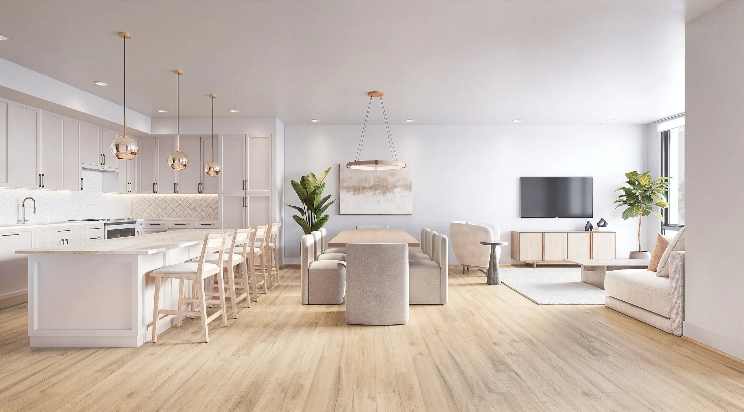
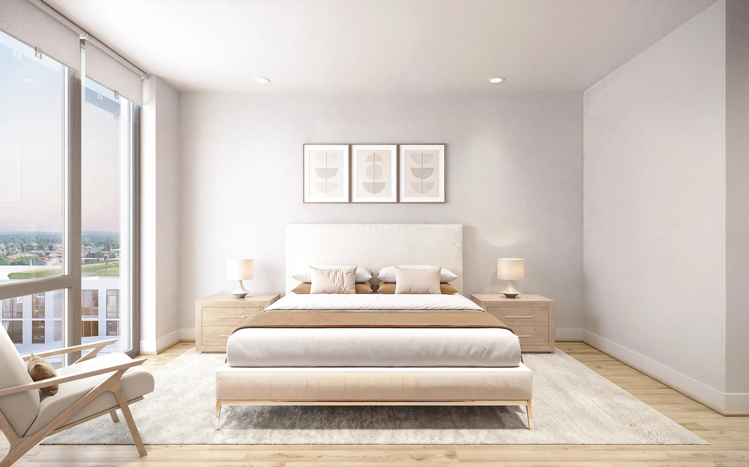
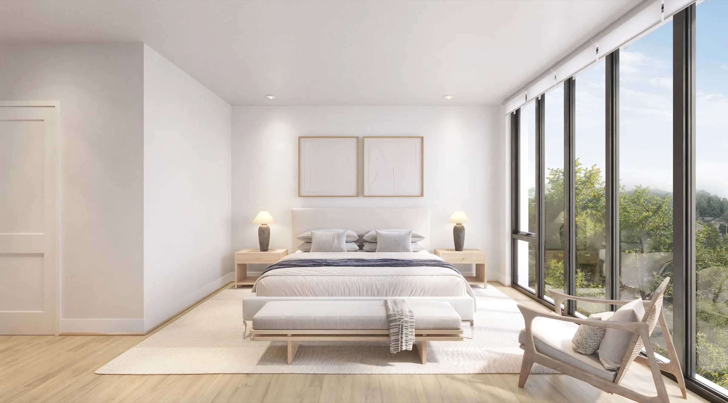
- 01Lift the furnishings to the homes’ higher price point: elevated, transitional, and neutral, with restrained accessories and artwork that reads as real art rather than stock.
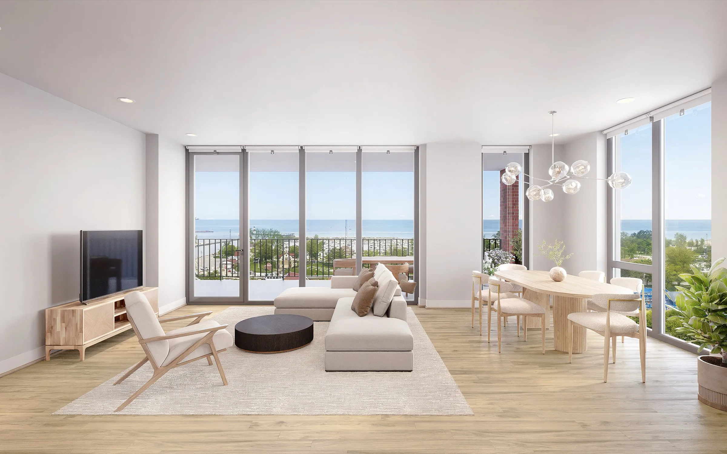
- 02Pull the Lake Michigan and downtown views into every room, with blinds shown only at the head of the glass so the outlook stayed open.
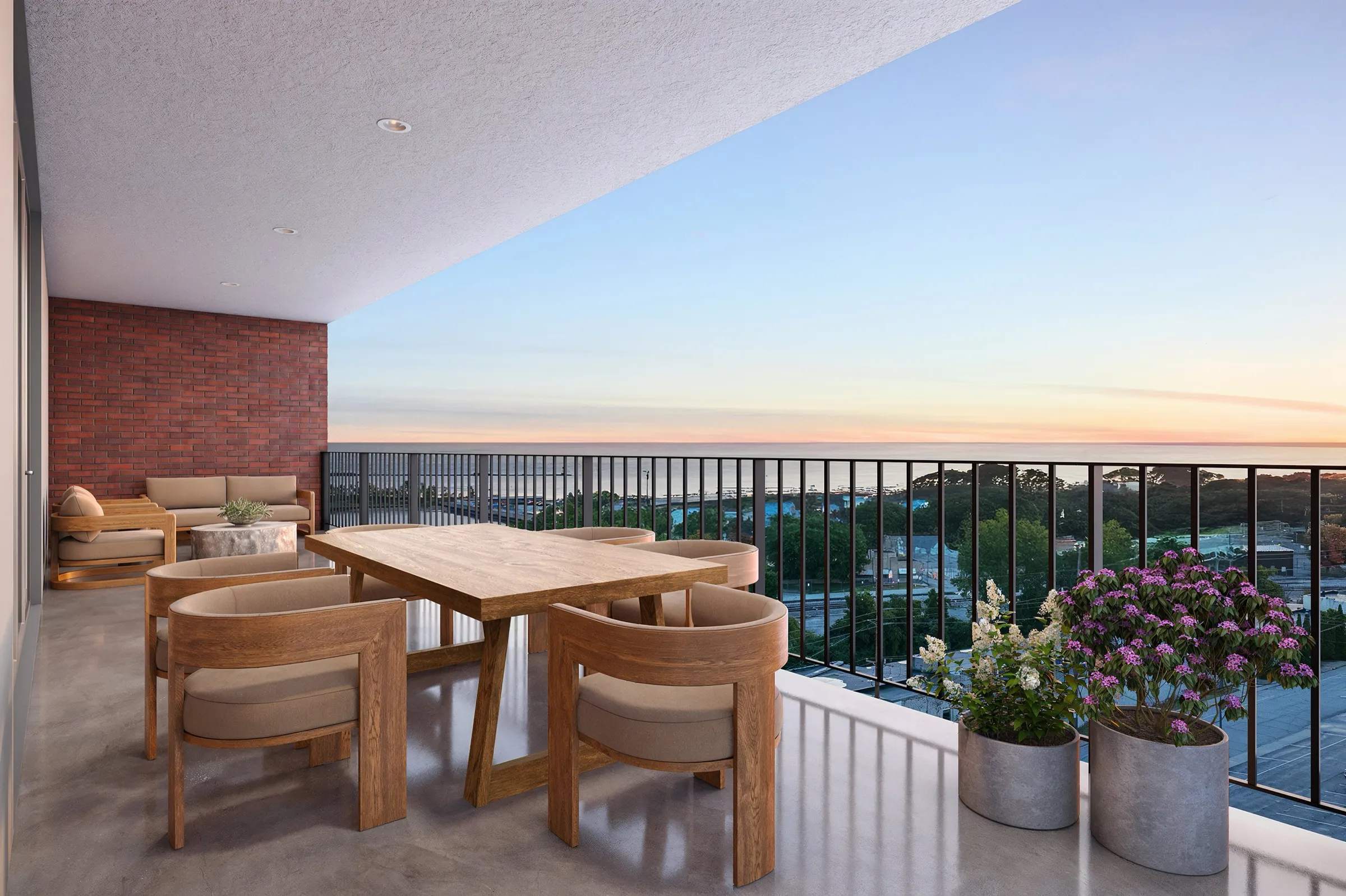
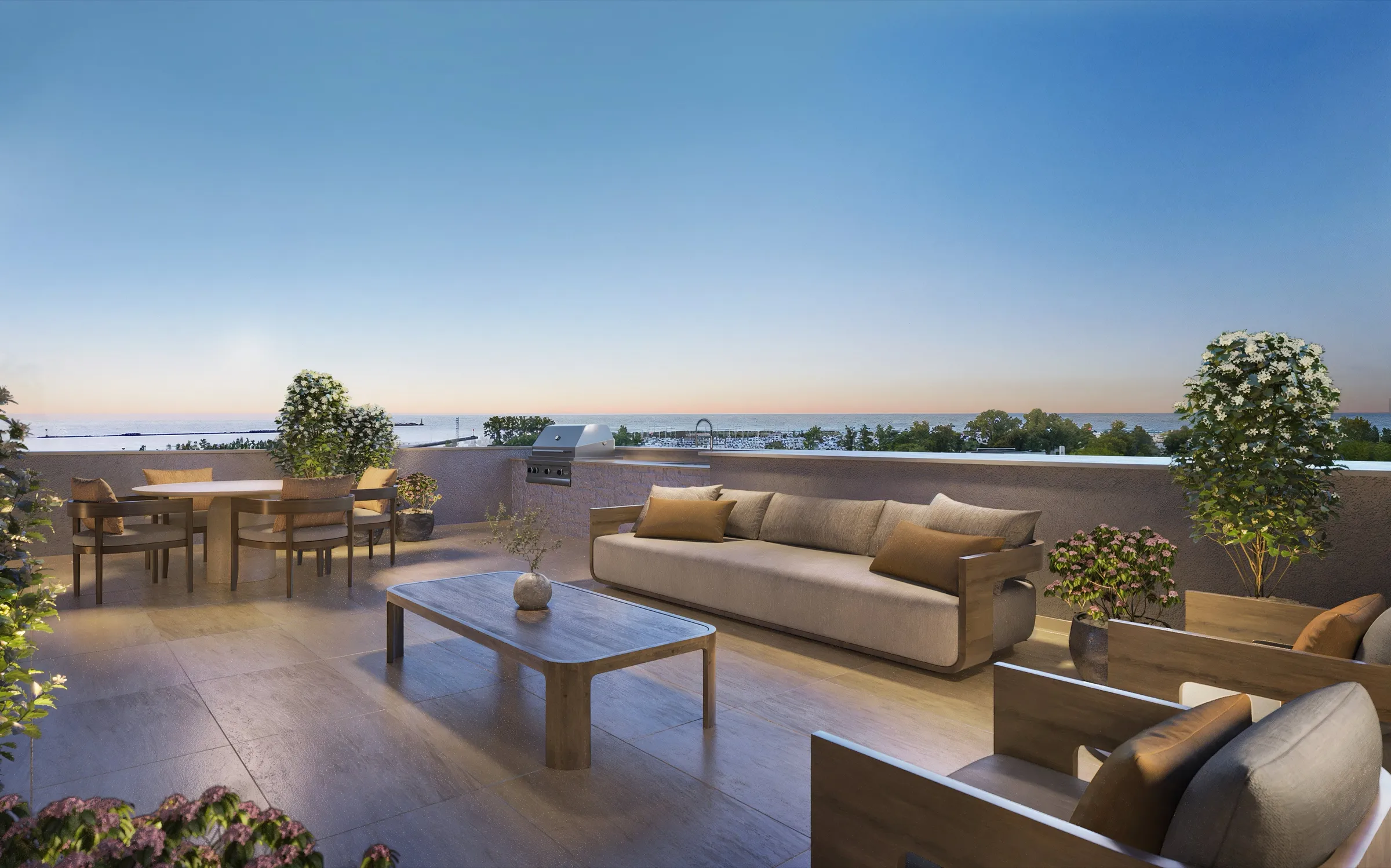
- 03Light the terraces and rooftops at twilight, the hour the marketing wanted, without letting the interiors behind the glass go dark.
- 04Frame each room to read as large as it is, showing as much of the space as a single image could hold.
- 05Carry one elevated material language across both tiers, since the residences and the townhomes shared the same interior features.
It also had to satisfy a room full of people. The visuals would pass first through the developer's marketing group and then the developer itself, a lot of cooks in the kitchen, so the work had to be right enough to survive several rounds of review without losing the selling season.
The approach
Built in Stages, Signed Off at Each One.
With this many decisions to get right and this many people to get them past, the work ran through the studio's staged sequence so nothing expensive was decided by surprise. A 3D model was built from the plans first. Then white-model views, untextured, with the furniture already placed, so the team could lock the camera angles and the composition of every room before a single surface was rendered. A mood board for the finishes and lighting ran in parallel. Only after those were approved did color rendering begin, with feedback gathered round by round on an online review platform, and the animation followed the same path, a white-model storyboard cut first, then the color film.
Working this way meant the hard calls, the furnishing level, the palette, the lighting temperature, were settled with the developer and its marketing team along the way, not argued over once the renders were finished. It also left room to absorb the architecture as it changed: the terrace railings moved from glass to black wrought iron, and the building's brick was carried onto the covered terraces, both resolved inside the model.
The views got the same rigor. Rather than invent the outlook, we worked from the developer's own drone footage of the actual views at the Residence 925 level and from the rooftops, and built the renders around it. For an off-plan buyer who could not yet stand on a terrace, that is what made the lake in every window something to trust.
Art direction
The Details That Read the Price.
The finishes and cabinetry were fixed, so the elevation had to happen in the styling. Every move below was about taking a render from basic to a level a city buyer would believe at this price.
Before
The developer’s earlier renderings looked, in the client’s own words, very basic.
After
Furnishings rebuilt as elevated and transitional, neutral and textural, the level a higher price point expects.
Before
Artwork that reads as stock, the same pieces cheaper renderings reuse on every wall.
After
Artwork treated as real art, chosen and composed to belong in the room.
Before
A primary-bath angle that showed only the vanity and made the room feel small.
After
Reframed to show the shower and as much of the room as possible, and never the toilet.
Before
Glass terrace railings on the early drawings.
After
Black wrought iron, with the building’s brick carried onto the covered terraces.
Before
Rooms a single camera could flatten or make read small.
After
Wider, opened-up framing so each space reads at its true size.
Before
An outlook a buyer would have to take on faith.
After
Views built from the developer’s own drone footage of the real lake and town.
Twilight, not dark
The Outdoor Rooms Were the Sell.
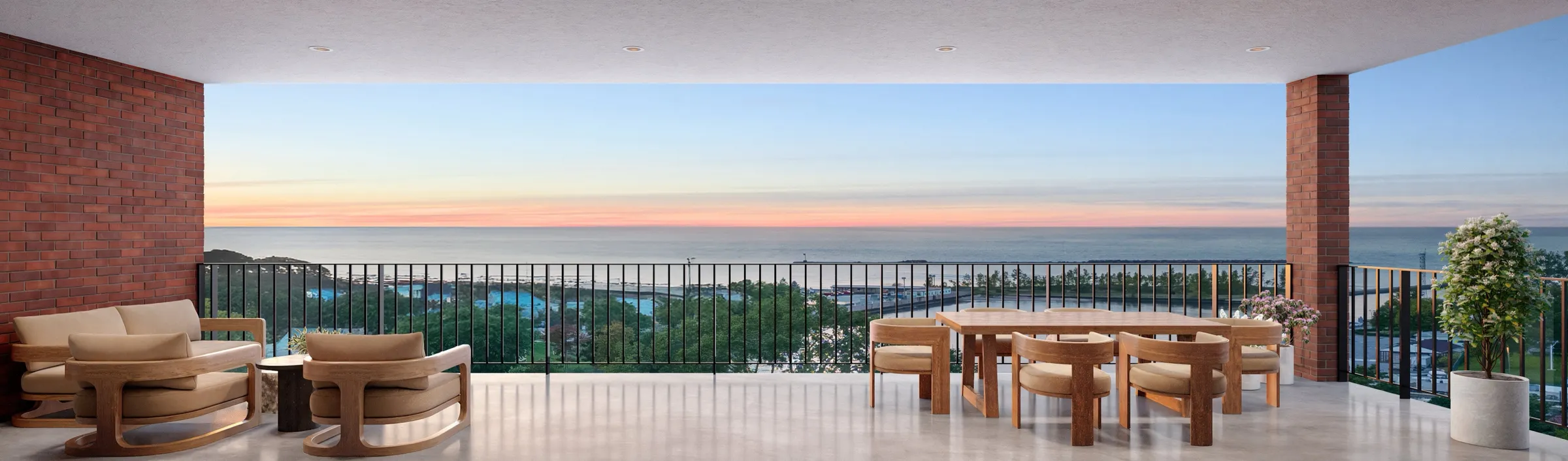
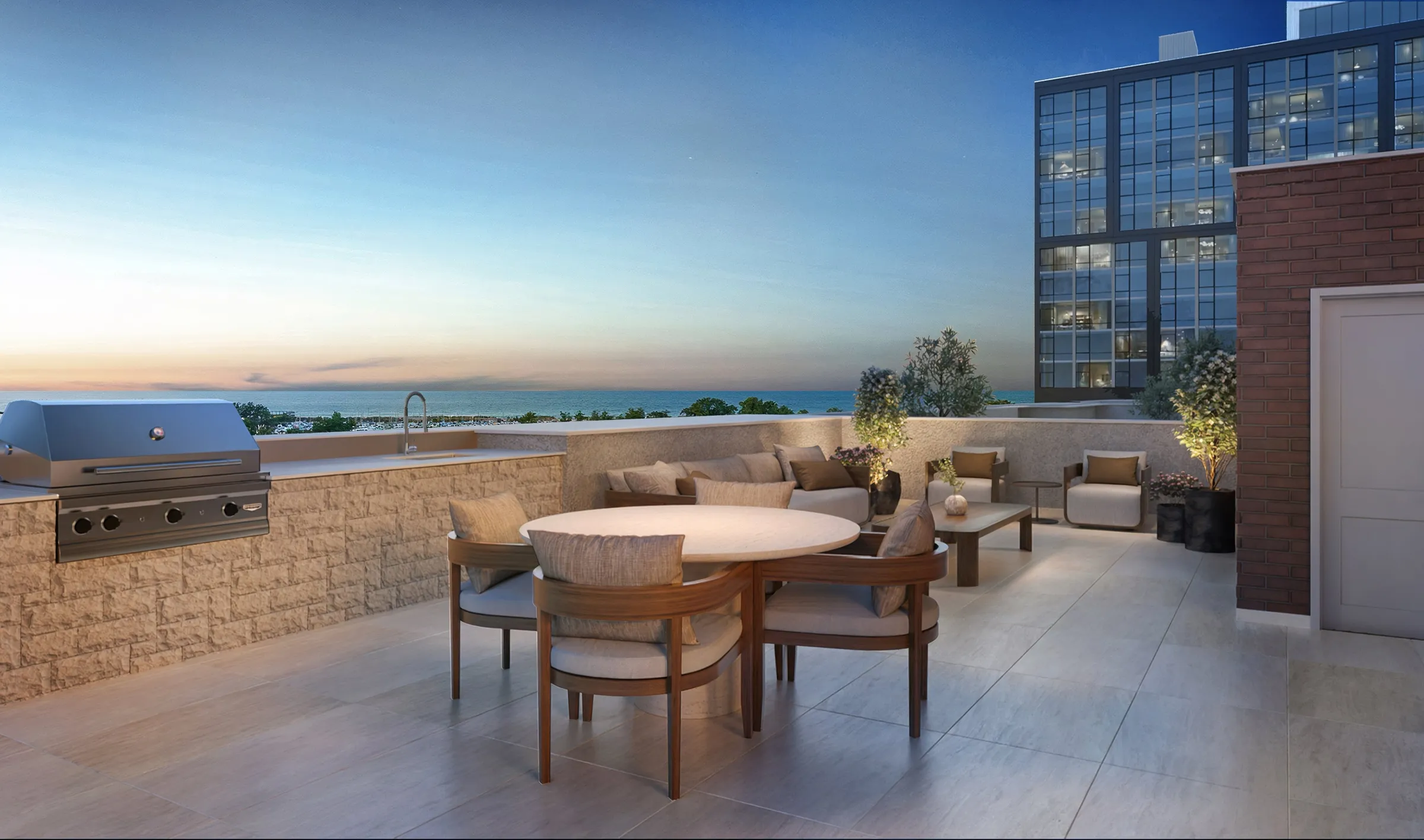
The marketing team wanted twilight on the terraces and rooftops, the hour that makes a lakefront home feel like somewhere you would rather be, but not at the cost of the rooms behind the glass going dark. So the exterior reads as dusk while the interiors stay warm and lit. The covered-terrace renders carry the building's brick onto the outdoor walls and set the new black wrought-iron railings against the sky, so the finish change reads as part of the place rather than a correction.
Two tiers, one language
One Address, Two Kinds of Home.
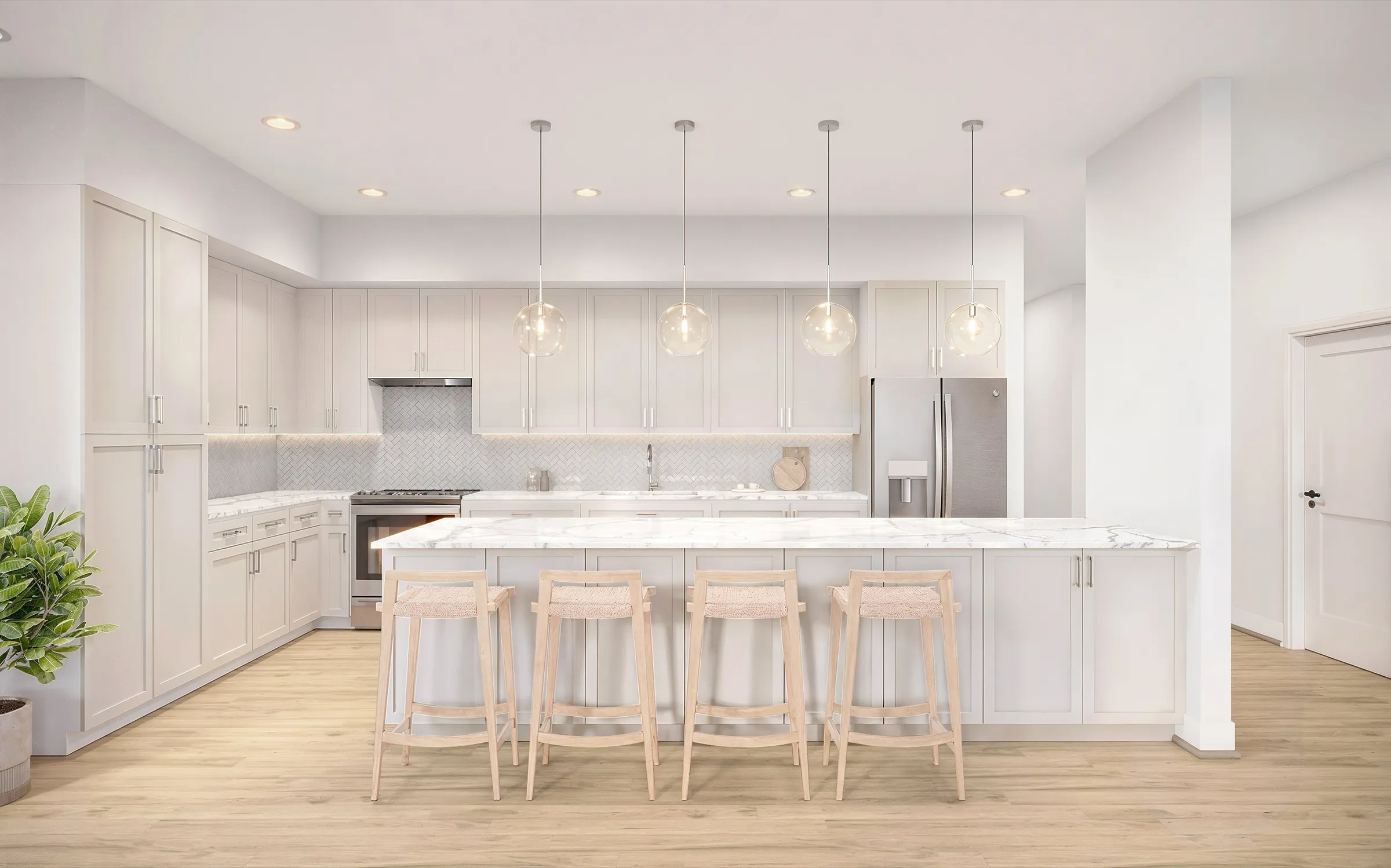
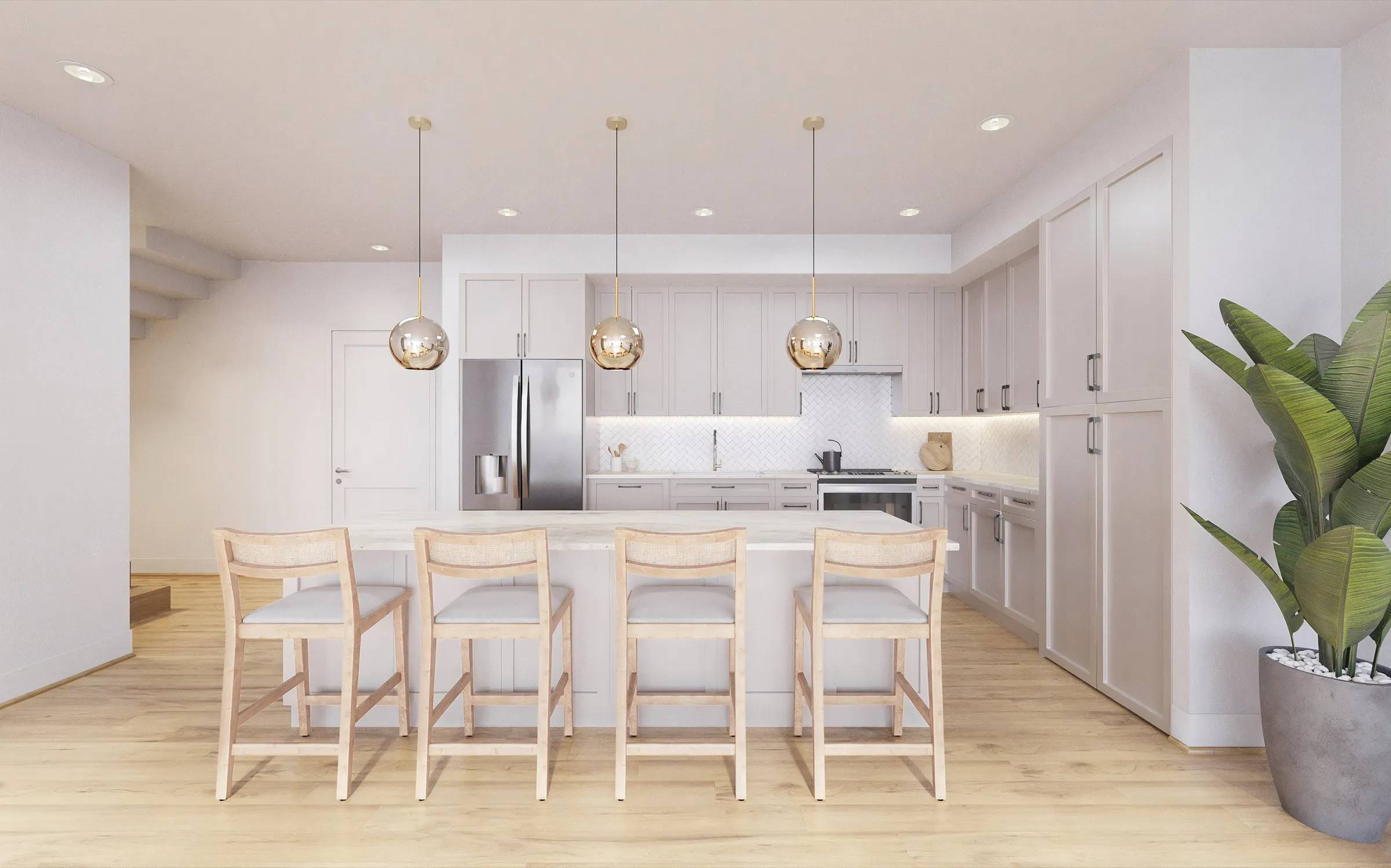
SoLa launched both tiers together, and the Residence 925 terrace residences and the townhomes shared the same interior features. Rather than treat them as two products, we built them from one elevated, transitional palette: soft grey cabinetry, marble islands, warm wood floors, neutral upholstery, and globe pendants, switched from glass to copper where the townhomes wanted a little more warmth.
The townhomes carry the idea up to their own rooftop decks, each with a built-in grill and an open view to Lake Michigan, the same outdoor-room thinking the residences get on their terraces. Read across the set, the two tiers feel like one coherent address, which is exactly what a buyer choosing between them needed to see.
The outcome
The Visuals Carried the Launch.
SoLa went to market in 2025 with both tiers launching together, and these renderings, plus the animation, were the face it showed buyers: the elevated interiors, the lake held open in every room, and the terraces and rooftops at twilight. With no homes yet built to walk, the visuals were the product, and they had been proven step by step, through the white-model approvals and the review rounds, before they ever reached a prospect.
The development itself did not ultimately move forward; the project was not realized. That outcome sat well outside the visualization, which did the job it was made for: giving a proposed lakefront community a coherent, credible face at the moment it asked the market to believe in it. The work stands as a record of how a two-tier development can be brought to a single, elevated address through interior rendering, art direction, and a staged, sign-off-driven process.
Questions
Launching a Development From Renderings
- What was SoLa in Michigan City?
- SoLa was a lakefront condominium and townhome development proposed by Farpoint Development for downtown Michigan City, Indiana, near the Lake Michigan shore, with architecture and interiors by KOO Architecture. It launched two unit tiers for sale in 2025, the Residence 925 terrace residences and the townhomes. NoTriangle Studio produced the interior and terrace renderings, and a marketing animation, that carried that launch. The development was ultimately not realized.
- How do you make an interior rendering match a higher price point?
- Through the furnishing, the framing, and the light, not just the architecture. For SoLa the finishes and cabinetry were fixed, so the elevation happened in the styling: transitional, neutral pieces with restrained accessories, artwork composed to read as real art, and rooms framed wide to show their full size. The Lake Michigan views were pulled into every space, with window treatments kept at the head of the glass so nothing competed with the outlook.
- How do renderings sell two unit tiers at once?
- With one material language carried across both. The Residence 925 terrace residences and the townhomes shared the same interior features, so the kitchens, living spaces, bedrooms, and outdoor rooms were built from a single elevated palette and lit the same way. That let the two tiers launch together as one coherent address rather than two separate products, with the work staged so the developer and its marketing team approved each step before the next began.
Services on this project
Related projects
- Anindell, a 55+ active-adult community launched on its amenities in Folsom
- The Elysian, a 48-unit luxury condominium launch in Montego Bay
- Vivere by Solterra, a high-rise condominium pre-sales launch in Surrey
- Muse, a 108-home condominium in Guildford, Surrey
- Orson Williamsburg, a boutique condominium launch in Brooklyn
Start with a discovery call
Every project starts with a conversation. The call is where we understand the project and whether we're the right studio to do the work.