Case study
122 Pine Cone Road
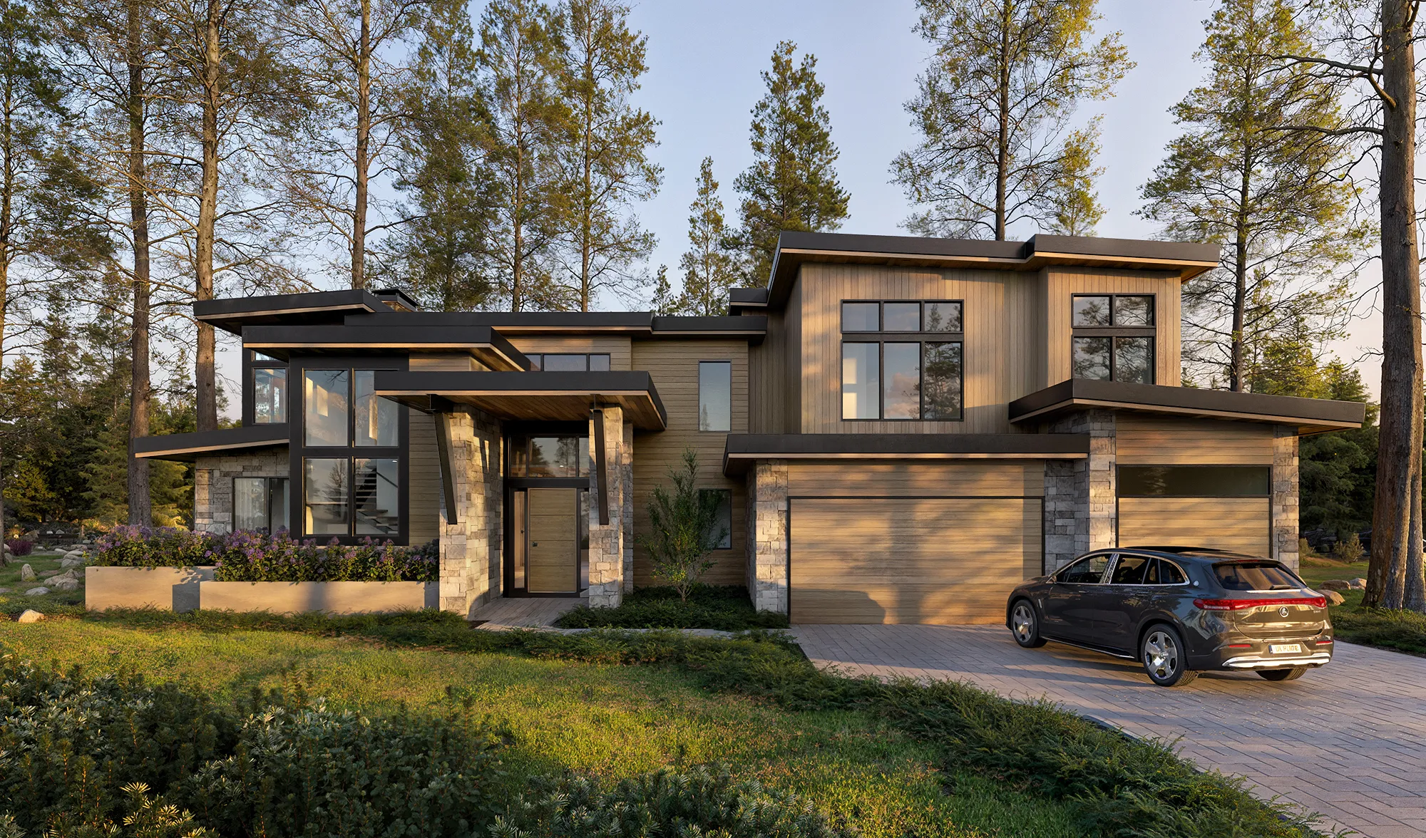
Interior and exterior renderings for a mountain-modern home being rebuilt in Incline Village, built to carry a single material story through every room and to show the Sierra setting honestly, so a high-altitude Tahoe house could be marketed before it was finished.
Project at a glance
A 1960s cabin on one of Incline Village's established luxury streets was being rebuilt into a mountain-modern home, still under construction with no finished interiors to photograph. NoTriangle built the interior and exterior marketing renderings, anchored on a single wood tone running from the floors to the facade and an honest portrayal of the home's high Sierra setting, so the house could be shown before it was finished.
- Commissioned by
- Compass, listing agent Ryan Mitchell
- Interior design
- Peak Design Tahoe (Katherine Buckton)
- Building type
- Luxury single-family residence
- Location
- Incline Village, Nevada (Lake Tahoe)
- Purpose
- Pre-sales, marketing a home before completion
- Scope
- 8 renderings (3 exterior, 5 interior) and an 80-second film
- Timeline
- 3 to 4 weeks
- Engagement
- One of multiple projects with Compass
The film
Interior and exterior 3D visualization of the Pine Cone Road home
The challenge
Selling a House That Did Not Exist Yet.
A house that does not exist yet has to be sold on its renderings, and on Pine Cone Road the bar for that is high. The street sits among Incline Village's established luxury homes on the Nevada side of Lake Tahoe, where finished houses trade well into the millions, and the property at 122 was not a finished house at all. It was a 1960s cabin being rebuilt into a contemporary mountain-modern home, still under construction, with workers on site, no completed interiors to photograph and, for much of the project, no landscape plan at all. The renderings were the only way to show a buyer what the finished home would be.
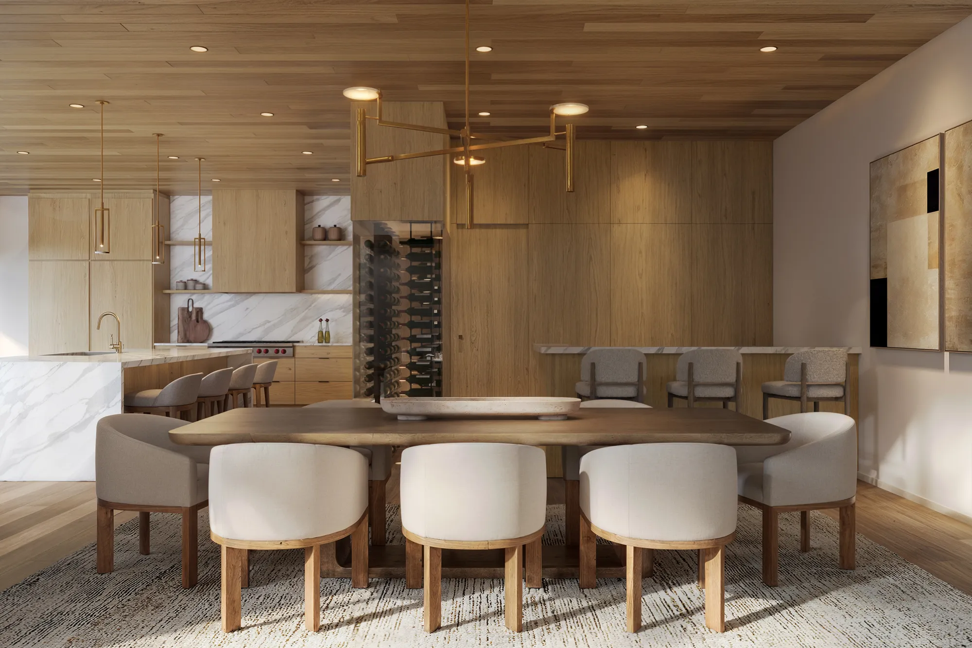
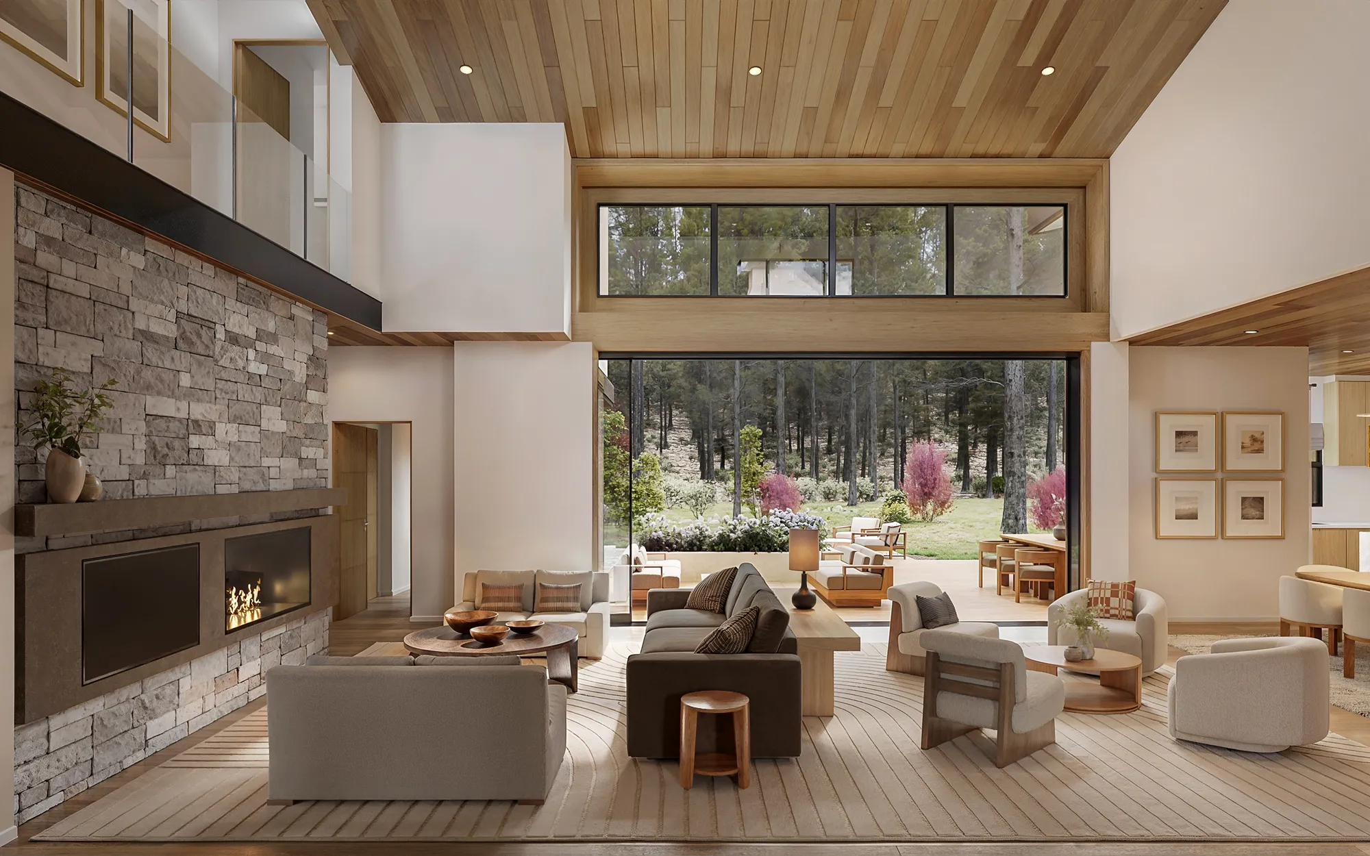
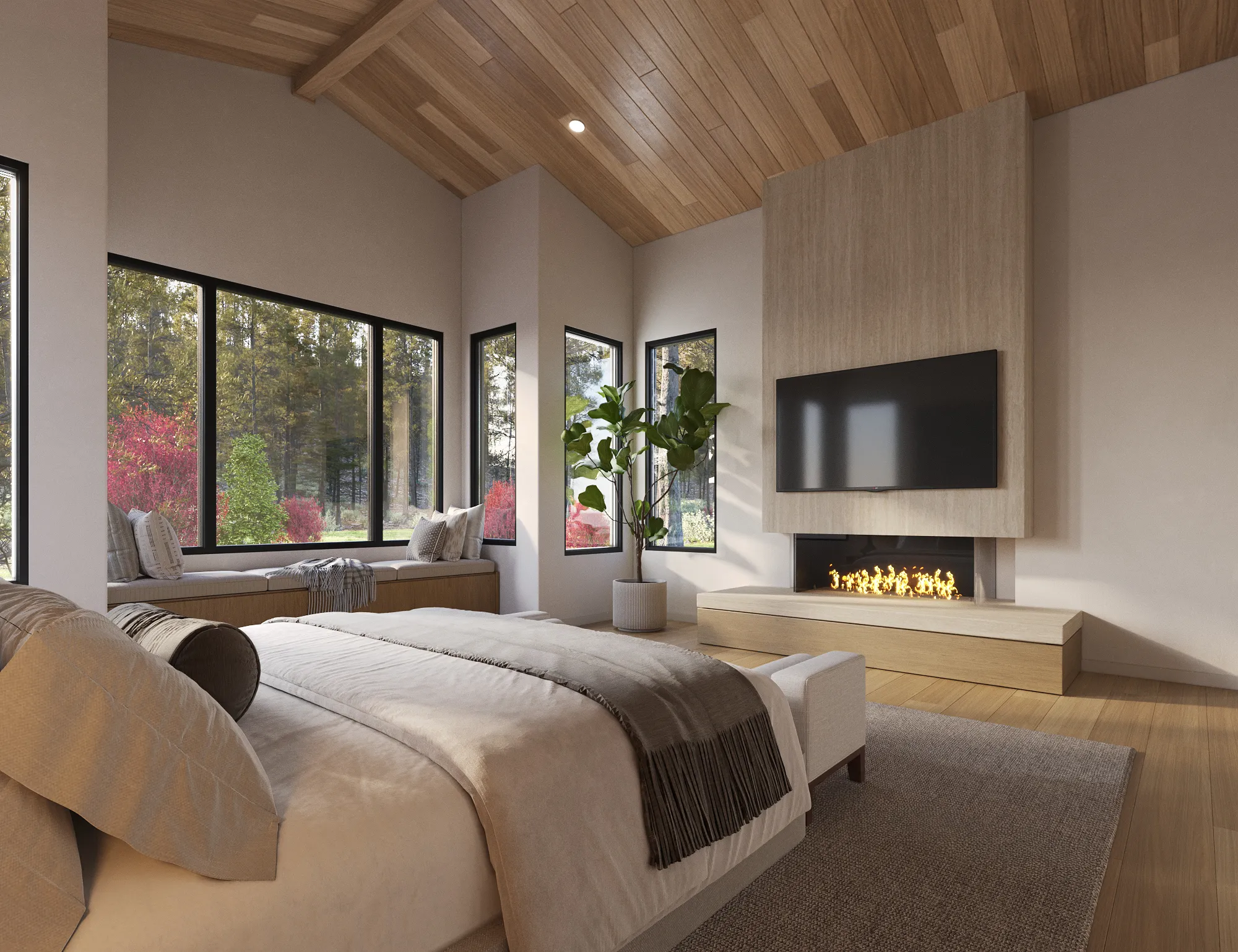
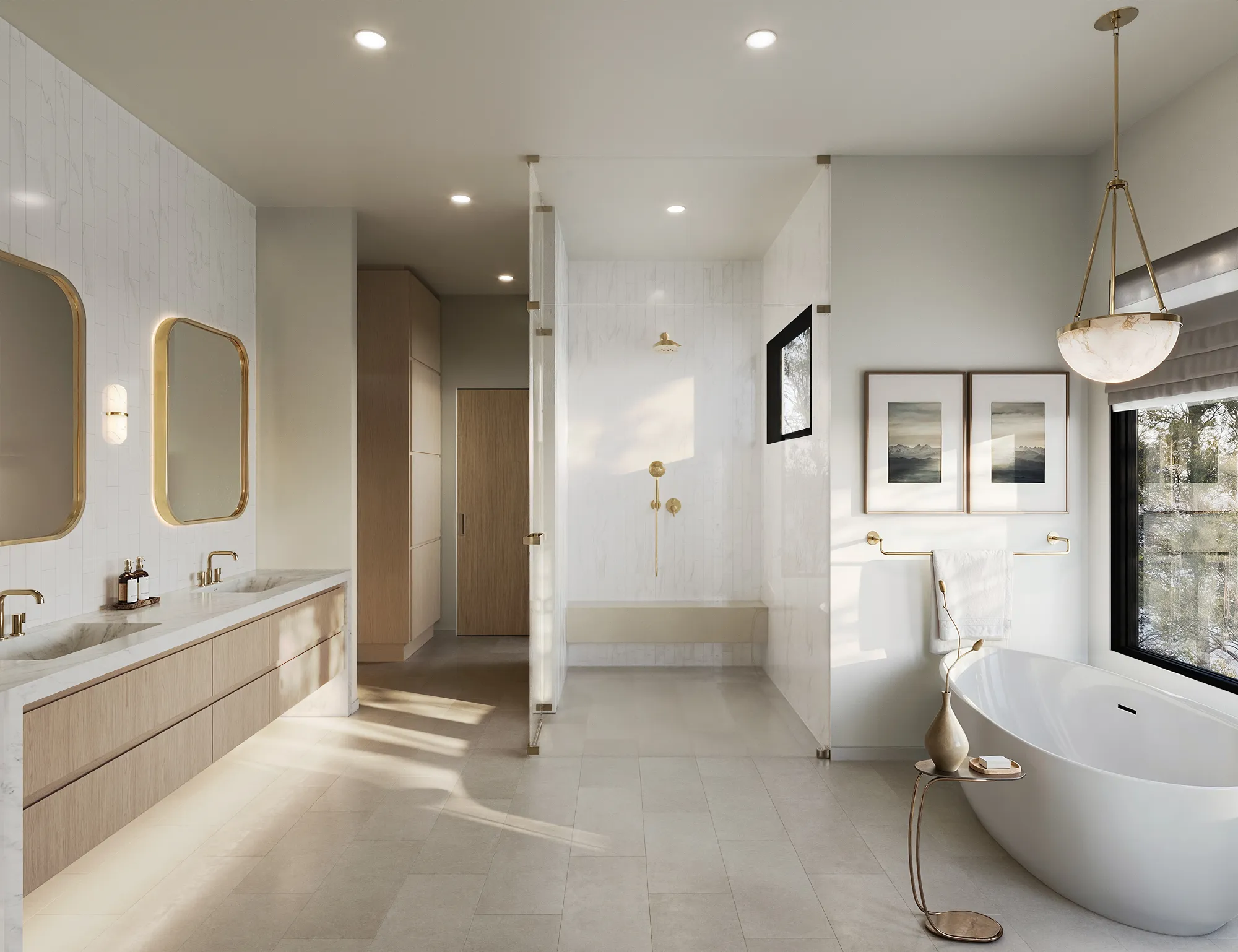
The design direction came from an interior designer who knew exactly what she wanted and could see the half-degree of difference between right and wrong. The governing idea was a single material story: one wood tone, carried without a break across the flooring, the cabinetry, the interior doors and the exterior cladding, so the whole house would read as one continuous thought rather than a collection of rooms. That tone was specific and hard to hit. It had to be taupe and cool, with a hint of grey, never golden or yellow, and a touch deeper than the references first suggested, a mid-tone sitting between two samples that each looked wrong on their own. The cabinets were white rift oak veneer in a cooler stain; the kitchen counters and splash were a Neolith Calacatta porcelain slab; the rooms had to feel calm and uncrowded, with furniture grouped to actually function rather than pushed to the walls.
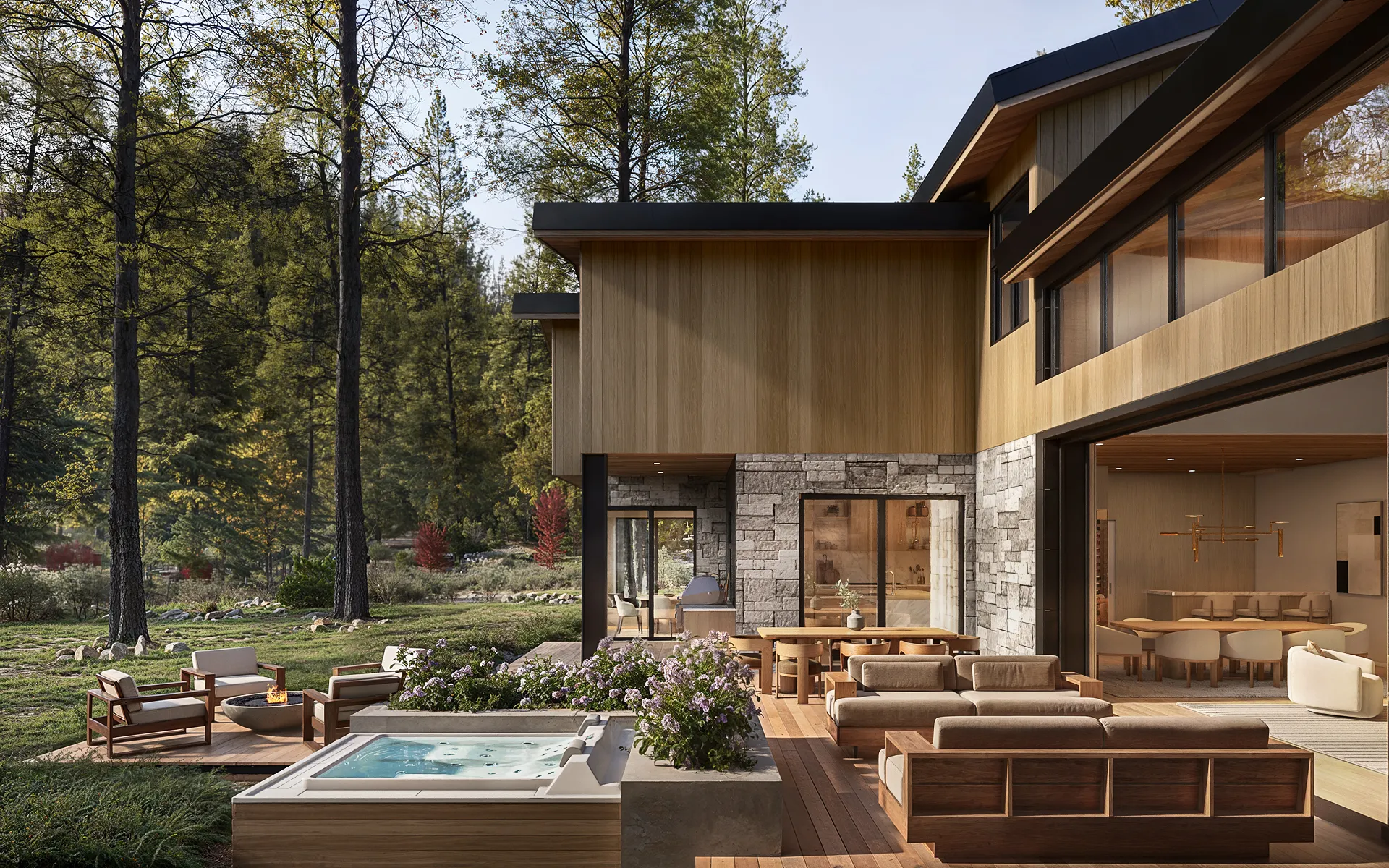
The other half of the brief was honesty about place. This is a home at nearly 7,000 feet, and the designer was firm that the imagery had to be true to it. Earlier landscape passes had used plants that do not grow at that altitude and a foreground that read as manicured gravel; she wanted soft, organic, native plantings, a real Sierra mountain backdrop visible where a buyer would actually see it and absent where they would not, and nothing that would mislead a buyer about the views or the setting. "We don't want to be deceptive with what we're portraying" was, in plain terms, the rule. On top of all of it, the project moved in reverse, with furniture chosen before the architecture was finalized, so the design kept evolving (entry details, facade cladding, the removal of some exterior steel, an updated wine and bar layout) and the renderings had to keep pace.
The approach
One Material, One Setting, Steered at Every Step.
The work was organized around the two things the brief cared most about, one unified material and a setting shown truthfully, and built through the studio's staged process so the designer could steer at every step instead of judging only at the end.
The material story came first because everything depended on it. Rather than chase the exact wood through trial and error, the studio worked from a single agreed reference and treated the tone as a post-production conversation across the whole set: floors, cabinets, doors and exterior cladding tuned to one cool, taupe mid-tone, deep enough to read as intentional, never yellow, with the natural grain variation of the wood left to show through. Only the built, hard surfaces took that tone; furnishings and decor stayed free, so the architecture read as one piece without flattening the rooms. The finishes the designer had specified were modelled as specified, the white rift oak veneer cabinetry with its flush panels and channel pulls, the Neolith Calacatta counters and splash, brass fixtures in the bath, and the renderings were framed and dressed the way a designer stages a room: a living-room grouping pulled together and centred on the coffee table so it could "speak without yelling," a fireplace surround deepened and a flush television, art with real colour on the walls, a code-correct rail shown with metal posts, a bath laid out so the shower controls fall where a hand can actually reach them.
The setting was handled with the same care. The gravel foreground gave way to soft, organic native plantings and a single tree; non-regional species were stripped out in favour of what grows at altitude; and the mountain backdrop was put back exactly where a buyer would really see it and kept out of the views where they would not, so no image promised a vista the house does not have. Through all of it the studio ran its standard method: white, untextured model views for both interiors and exteriors so the cameras and angles could be locked before any finish was committed, then a mood board for light and materials, then colour. Revisions ran through Review Studio, the studio's online markup platform, where the designer could mark up each scene directly and the studio could answer in kind, which mattered on a project this detailed and this fluid, with the design still changing as the house was built.
In the renders
One Continuous Material, Floor to Facade.
The unified wood tone carries across the floors, the cabinetry, the interior doors and the exterior cladding, balanced image to image so the set reads as a single home rather than a collection of unrelated rooms. Only the built surfaces take the tone; the furnishings stay free, so the architecture reads as one piece without flattening the space.
The production
One House Made From Many Surfaces.
The renderings were built to make one house out of many surfaces. The unified wood tone was carried across the floors, the cabinetry, the interior doors and the exterior cladding, tuned to the cool taupe mid-tone the designer wanted and balanced image to image so the set read as a single home rather than a set of unrelated rooms. The kitchen was modelled with its flush-panel white rift oak veneer cabinets, channel pulls, the Neolith Calacatta porcelain counters and splash, a bar with continuous wood paneling, a wine display and a butler's pantry kept closed behind a clean panel line. The living room was staged as a working conversation group, the surround deepened around a flush television, art given colour, the rail made code-correct. The primary bath carried the Calacatta slab, brass fixtures and a warm sand-toned floor. Outside, the terrace and facade were dressed in soft native plantings and the matching wood cladding, with the Sierra backdrop placed honestly view by view.
The set moved through the staged review rather than a single reveal: white model views to fix the angles, a mood board for finishes and light, then colour, with revision rounds tracked in Review Studio as the design kept developing. Because the project ran in reverse, with furnishings chosen ahead of the finalized architecture, the studio absorbed a steady stream of changes (entry and front-door details, cladding swaps that removed some exterior steel, the updated bar and wine layout) and kept the imagery current with the house as it was actually being built.
The outcome
A Construction Site, Shown as the Home It Was Becoming.
The renderings gave a home that was still a construction site a way to be seen as the finished house it was becoming: a mountain-modern residence on one of Incline Village's established luxury streets, told as a single continuous material from the floors to the facade, and set honestly in its high Sierra surroundings.
For a property being prepared for the Lake Tahoe market through a Compass listing agent, with no finished interiors to photograph, that imagery was the listing's first and only picture of the result.
Questions
Marketing a Mountain Home Before It Is Built
- How do you market a luxury home that is still under construction?
- With renderings, because there is nothing to photograph yet. At 122 Pine Cone Road the house was being rebuilt down to the structure, with no finished rooms and no completed landscape, so the imagery had to stand in for the whole house. NoTriangle built the interiors and exteriors from the CAD files, the designer's finish and furniture specs, and the real site, so the listing could show a buyer the finished mountain-modern home well before it physically existed.
- How do you make every room in a house feel like one design?
- By treating the material as a single story rather than a per-room decision. Here the brief was one wood tone carried without a break across the flooring, the cabinetry, the interior doors and the exterior cladding, a cool, taupe mid-tone, never golden, with the natural grain left visible. The studio tuned that tone across the entire set in post-production so the rooms talked to each other and the house read as one continuous thought, while keeping furnishings and decor free so the rooms still felt alive.
- How do you keep a rendering honest about a mountain setting?
- By showing what actually grows and what a buyer would actually see. At nearly 7,000 feet, generic landscaping and stock backdrops read as false, so non-regional plants were stripped out in favour of soft, organic native plantings, and the Sierra mountain backdrop was placed only in the views where it is genuinely visible and left out of the ones where it is not. The point, in the designer's words, was not to be deceptive about the views or the setting.
- How much of a listing agent's time does a rendering package like this take?
- Very little, which is usually the point. The agent behind 122 Pine Cone Road found the studio through renderings he had seen on another listing at Clear Creek Tahoe, reached out through the website, sent over the CAD files, and chose a package. From there the interior designer, Katherine Buckton of Peak Design Tahoe, drove every review round directly, steering the wood tones, the plantings, and the furniture, while the agent stayed copied on progress. The agent's time went into the decisions only the listing side can make; the detailed production conversation sat with the designer who knew the design best.
Services on this project
Related projects
Start with a discovery call
Eddie Kingsnorth runs the first conversation. The call is where we understand the project and whether we're the right studio to do the work.